Starter Template
1 |
|
Container
Bootstrap also requires a containing element to wrap site contents.
There are two container classes to choose from:
- The
.containerclass provides a responsive fixed width container. - The
.container-fluidclass provides a full width container, spanning the entire width of the viewport
Grid
Bootstrap’s grid system allows up to 12 columns across the page.
Bootstrap’s grid system is responsive, and the columns will re-arrange automatically depending on the screen size.
The Bootstrap grid system has four classes:
- xs (for phones)
- sm (for tablets)
- md (for desktops)
- lg (for larger desktops)
Creating a row use the syntax1
<div class="row">
then, add the size and the number of columns, syntax like: class=’col-*-*‘, example:1
<div class="col-sm-4"></div>
Example: Adding a 3 equal-width columns:
Images
The following class can be used to style any images:
| Class | Description |
|---|---|
| .img-rounded | Add rounded corners to an image |
| .imag-circle | An circle image |
| .imag-thumbnail | Shapes the image to a thunmbnail |
| .img-responsive | Image will scaled nicely to the parent |
Example:1
2
3<div class="container">
<img class="img-responsive" src="img_chania.jpg" alt="Chania" width="460" height="345">
</div>
Image Gallery
Use grid system and the .thumbnail class to create an image gallery1
2
3
4
5
6
7
8
9
10
11
12
13
14
15
16
17
18
19
20
21
22
23
24
25
26
27
28
29
30
31
32<div class="row">
<div class="col-md-4">
<div class="thumbnail">
<a href="/w3images/lights.jpg">
<img src="/w3images/lights.jpg" alt="Lights" style="width:100%">
<div class="caption">
<p>Lorem ipsum...</p>
</div>
</a>
</div>
</div>
<div class="col-md-4">
<div class="thumbnail">
<a href="/w3images/nature.jpg">
<img src="/w3images/nature.jpg" alt="Nature" style="width:100%">
<div class="caption">
<p>Lorem ipsum...</p>
</div>
</a>
</div>
</div>
<div class="col-md-4">
<div class="thumbnail">
<a href="/w3images/fjords.jpg">
<img src="/w3images/fjords.jpg" alt="Fjords" style="width:100%">
<div class="caption">
<p>Lorem ipsum...</p>
</div>
</a>
</div>
</div>
</div>
Jumbotron
A jumbotron is displayed as a big grey box with rounded corner. It enlarges the font size of the text inside it for calling attention to some special contents or informations.
Use a div element with class .jumbotron to create a jumbotron. We could place the jumbotron inside or outside the < div class=”container” > , depends on if you want jumbotron to extend to the edge of the screen or not.1
2
3
4
5
6
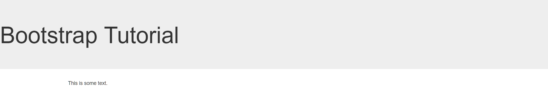
7<div class="jumbotron">
<h1>Bootstrap Tutorial</h1>
</div>
<div class="container">
<p>This is some text.</p>
</div>
Well
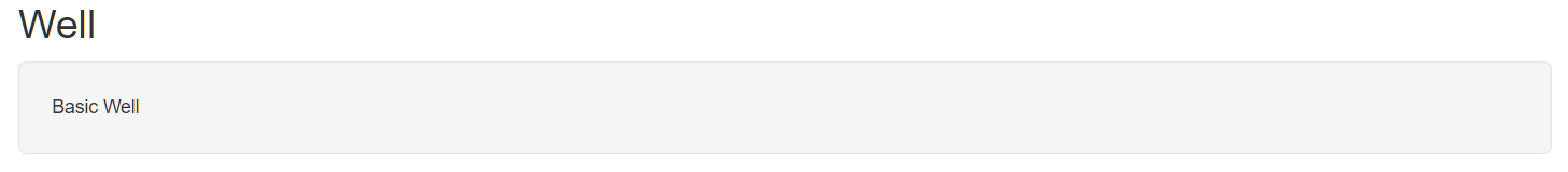
The .well class adds a rounded border around an element with grey background color and some padding. Change the size of the well by adding the .well-sm or .well-lg class.1
2
3
4<div class="container">
<h2>Well</h2>
<div class="well well-lg">Basic Well</div>
</div>
Alert
Alerts are created with .alert class, follwed by one of the four classes .alert-success .alert-info .alert-warning .alert-danger. Add .alert-link class to any links inside the alert box to create “matching colored links”.1
2
3
4
5
6
7
8
9
10
11
12
13
14<div class="container">>
<div class="alert alert-success">
<strong>Success!</strong> You should <a href="#" class="alert-link">read this message</a>.
</div>
<div class="alert alert-info">
<strong>Info!</strong> You should <a href="#" class="alert-link">read this message</a>.
</div>
<div class="alert alert-warning">
<strong>Warning!</strong> You should <a href="#" class="alert-link">read this message</a>.
</div>
<div class="alert alert-danger">
<strong>Danger!</strong> You should <a href="#" class="alert-link">read this message</a>.
</div>
</div>
would be: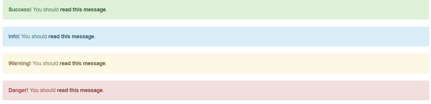
To close the alert message, add a .alert-dismissable class to the alert container and class=’close’ and data-dismiss=’alert’ to a link or a button element(click on this, alert message will disappear)
1 | <div class="container"> |
would be:
Button
The button classes can be used on an < a > , < button > or < input > elements with different color and size.1
2
3
4
5
6
7
8
9<div class="container">
<button type="button" class="btn btn-xs">Basic</button>
<a href="#" class="btn btn-info btn-sm" role="button">Link Button</a>
<button type="button" class="btn btn-primary btn-md">Button</button>
<button type="button" class="btn btn-success btn-lg">Button</button>
<input type="button" class="btn btn-warning btn-md" value="Input Button">
<input type="submit" class="btn btn-danger btn-sm" value="Submit Button">
<button type="button" class="btn btn-link btn-xs">Link</button>
</div>
would be: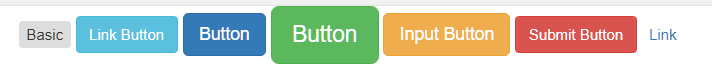
Block level button spans the entire width of the parent element.
A button could be set to an active or disabled state.1
2
3
4
5
6
7
8
9
10
11<style>
.btn-primary {
background: #ABC864;
}
</style>
<div class="container">
<button type="button" class="btn btn-primary">Primary Button</button>
<button type="button" class="btn btn-primary active btn-block">Active Primary</button>
<button type="button" class="btn btn-primary disabled btn-block">Disabled Primary</button>
</div>
would be: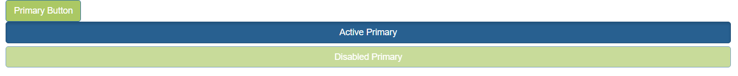
Button groups and dropdown menu
Use the .btn-group class within a < div > element to create a button group, specify the size with .btn-group-lg|sm|xs class, and the vertical orientation(default is horizontal) with .btn-group-vertical class.1
2
3
4
5
6
7<div class="container">
<div class="btn-group-vertical btn-group-lg">
<button type="button" class="btn btn-primary">Apple</button>
<button type="button" class="btn btn-primary">Samsung</button>
<button type="button" class="btn btn-primary">Sony</button>
</div>
</div>
would be: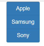
Dropdown menus button:1
2
3
4
5
6
7
8
9
10
11
12
13
14<div class="container">
<div class="btn-group">
<button type="button" class="btn btn-primary">Apple</button>
<button type="button" class="btn btn-primary">Samsung</button>
<div class="btn-group">
<button type="button" class="btn btn-primary dropdown-toggle" data-toggle="dropdown">
Sony <span class="caret"></span></button>
<ul class="dropdown-menu" role="menu">
<li><a href="#">Tablet</a></li>
<li><a href="#">Smartphone</a></li>
</ul>
</div>
</div>
</div>
would be: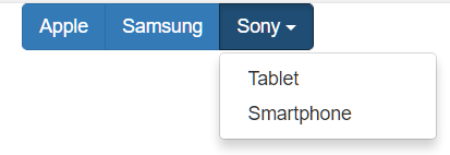
Split button dropdown1
2
3
4
5
6
7
8
9
10
11
12<div class="container">
<div class="btn-group">
<button type="button" class="btn btn-primary">Sony</button>
<button type="button" class="btn btn-primary dropdown-toggle" data-toggle="dropdown">
<span class="caret"></span>
</button>
<ul class="dropdown-menu" role="menu">
<li><a href="#">Tablet</a></li>
<li><a href="#">Smartphone</a></li>
</ul>
</div>
</div>
would be: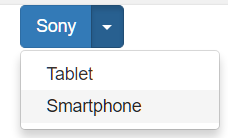
Badge
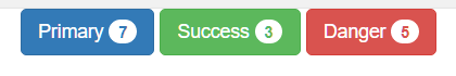
Use the .badge class within < span > elements to create badges:1
2
3
4
5<div class="container">
<button type="button" class="btn btn-primary">Primary <span class="badge">7</span></button>
<button type="button" class="btn btn-success">Success <span class="badge">3</span></button>
<button type="button" class="btn btn-danger">Danger <span class="badge">5</span></button>
</div>
Label
Use the .label class within < span > elements to create badges:1
2
3
4
5
6
7
8<div class="container">
<h1><span class="label label-default">Default Label</span></h1>
<h2><span class="label label-primary">Primary Label</span></h2>
<h3><span class="label label-success">Success Label</span></h3>
<h4><span class="label label-info">Info Label</span></h4>
<h5><span class="label label-warning">Warning Label</span></h5>
<h6><span class="label label-danger">Danger Label</span></h6>
</div>
would be: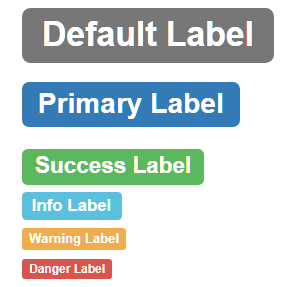
Progress bars
To create a default progress bar, add a .progress class to a < div > elements.
Bootstrap provides Colored progress bar, Striped progress bar, Animated progress bar and Stacked progress bar1
2
3
4
5
6
7
8
9
10
11
12
13
14
15
16
17
18
19
20
21
22
23
24
25
26
27
28
29<style>
.normal{
background: black;
}
</style>
<div class="container">
<div class="progress">
<div class="progress-bar progress-bar-success progress-bar-striped" role="progressbar" aria-valuenow="40" aria-valuemin="0" aria-valuemax="100" style="width:40%">
40% Complete (success)
</div>
</div>
<div class="progress">
<div class="progress-bar progress-bar-info progress-bar-striped active" role="progressbar" aria-valuenow="50" aria-valuemin="0" aria-valuemax="100" style="width:50%">
50% Complete (info)
</div>
</div>
<div class="progress">
<div class="progress-bar normal " role="progerssbar" style="width:20%">
20% Complete(black)
</div>
<div class="progress-bar progress-bar-warning" role="progressbar" style="width:60%">
60% Complete (warning)
</div>
<div class="progress-bar progress-bar-danger" role="progressbar" style="width:20%">
20% Complete (danger)
</div>
</div>
</div>
would be: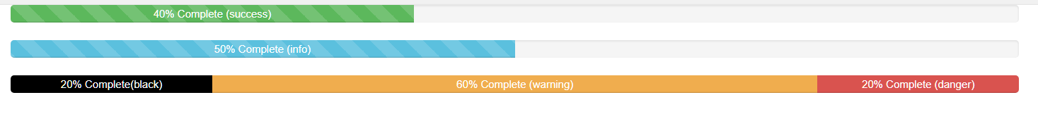
Pagination
If you have a website with lots of pages, you wish to add some sort of pagination to each page. To create a basic pagination, add the .pagination class to an < ul > element. Class .active indicate that the page that users are now on. Class .disabled means a link is for some reason disabled.
You can also set the size of the pagination with class .pagination-lg|sm.1
2
3
4
5
6
7
8
9<div class="container">
<ul class="pagination pagination-lg">
<li class="active"><a href="#" >1</a></li>
<li><a href="#">2</a></li>
<li><a href="#">3</a></li>
<li class="disabled"><a href="#">4</a></li>
<li><a href="#">5</a></li>
</ul>
</div>
would be: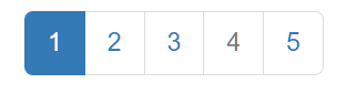
Another form for pagination if Breadcrumbs. The Breadcrumbs indicates the current page’s location within a navigation hierachy:1
2
3
4
5
6
7
8<div class="container">
<ul class="breadcrumb">
<li><a href="#">Home</a></li>
<li><a href="#">Private</a></li>
<li><a href="#">Pictures</a></li>
<li class="active">Vacation</li>
</ul>
</div>
would be: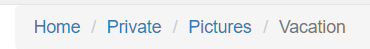
List groups
To create a basic list group, use an < ul > element with class .list-group and < li > element with class .list-group-item.1
2
3
4
5
6
7<div class="container">
<ul class="list-group">
<li class="list-group-item">New <span class="badge">12</span></li>
<li class="list-group-item">Deleted <span class="badge">5</span></li>
<li class="list-group-item">Warnings <span class="badge">3</span></li>
</ul>
</div>
would be: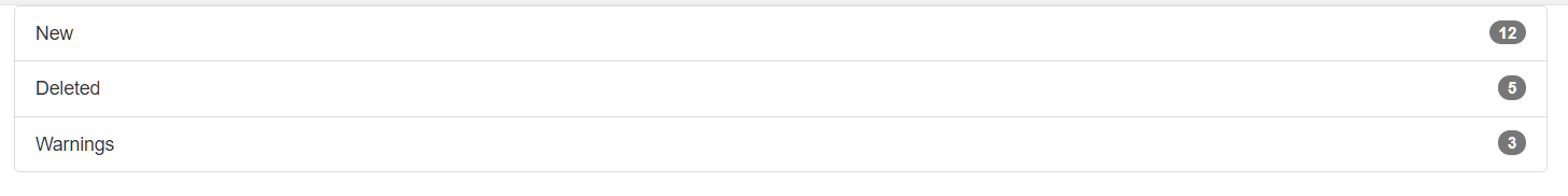
To create a list group with linked items, use < div > instead of < ul > and < a > instead of < li > :1
2
3
4
5
6
7<div class="container">
<div class="list-group">
<a href="#" class="list-group-item disabled">First item</a>
<a href="#" class="list-group-item">Second item</a>
<a href="#" class="list-group-item active">Third item</a>
</div>
</div>
would be: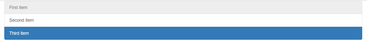
Bootstrap provides also colored and the class .list-group-item-heading and .list-group-item-text which can be used as follows:1
2
3
4
5
6
7
8
9
10
11
12
13
14
15
16<div class="container">
<div class="list-group">
<a href="#" class="list-group-item list-group-item-info">
<h4 class="list-group-item-heading">First List Group Item Heading</h4>
<p class="list-group-item-text">List Group Item Text</p>
</a>
<a href="#" class="list-group-item list-group-item-success">
<h4 class="list-group-item-heading">Second List Group Item Heading</h4>
<p class="list-group-item-text">List Group Item Text</p>
</a>
<a href="#" class="list-group-item list-group-item-warning">
<h4 class="list-group-item-heading">Third List Group Item Heading</h4>
<p class="list-group-item-text">List Group Item Text</p>
</a>
</div>
</div>
would be: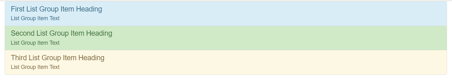
Panels
A panel is a bordered box with some padding around its content. Panel are created with the .panel class and content inside the panel has a .panel-body class.
The .panel-default class is used to style the color of the panel.
Panel has also heading and footer with class The .panel-heading and The .panel-footer.
To group many panels together, wrap a < div > class with class .panel-group around them. The .panel-group class clears the bottom-margin of each panel:1
2
3
4
5
6
7
8
9
10
11
12
13
14
15
16
17
18<div class="container">
<div class="panel-group">
<div class="panel panel-default">
<div class="panel-heading">Panel with panel-success class</div>
<div class="panel-body">Panel Content</div>
</div>
<div class="panel panel-info">
<div class="panel-heading">Panel with panel-info class</div>
<div class="panel-body">Panel Content</div>
</div>
<div class="panel panel-danger">
<div class="panel-heading">Panel with panel-danger class</div>
<div class="panel-body">Panel Content</div>
</div>
</div>
</div>
would be: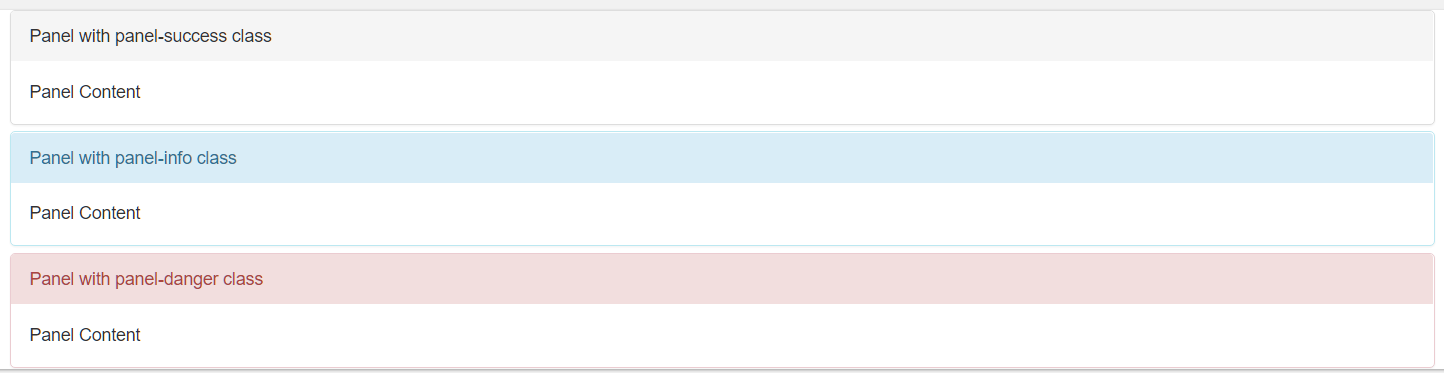
Dropdown
Dropdown menu is defined by the < div > element with class .dropdown.
To open the dropdown menu, use a button or a link with a class of .dropdown-toggle and the data-toggle=”dropdown” attribute.
.caretclass creates a caret arrow icon(), which indicates that the button is a dropdown..dropdown-menuclass within a< ul >element to actually build the dropdown menu..dividerclass is used to draw a horizontal border to seperate links..dropdown-headerclass is used to add a header inside the dropdown menu..disabledclass and.activeclass to disable and active a dropdown item..dropupinstead of.dropdownto expand upwards instead of downwards.1
2
3
4
5
6
7
8
9
10
11
12
13
14
15
16<div class="container">
<div class="dropdown">
<button class="btn btn-success dropdown-toggle" type="button" data-toggle="dropdown">Tutorials
<span class="caret"></span></button>
<ul class="dropdown-menu">
<li class="dropdown-header">Dropdown header 1</li>
<li><a href="#">HTML</a></li>
<li class="active"><a href="#">CSS</a></li>
<li class="disabled"><a href="#">JavaScript</a></li>
<li class="divider"></li>
<li class="dropdown-header">Dropdown header 2</li>
<li><a href="#">About Us</a></li>
<li><a href="#">Contanct Us</a></li>
</ul>
</div>
</div>
would be: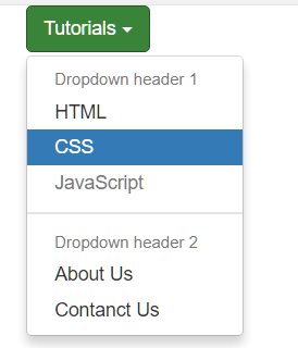
Collapse
.collapse class indicates a collapsible element. This is the content that will be shown or hidden.
To control the collapsible element, add the data-toggle=’collapse’ class to an <a> or <button> element.
Then, add the .data-target=”#id” class to connect the button with the collapsible content.
The collapsible content is by default hidden. However you can add the .in to show content by default:1
2
3
4
5
6
7
8<div class="container">
<button type="button" class="btn btn-info" data-toggle="collapse" data-target="#demo">Simple collapsible</button>
<div id="demo" class="collapse in">
Lorem ipsum dolor sit amet, consectetur adipisicing elit,
sed do eiusmod tempor incididunt ut labore et dolore magna aliqua. Ut enim ad minim veniam,
quis nostrud exercitation ullamco laboris nisi ut aliquip ex ea commodo consequat.
</div>
</div>
would be: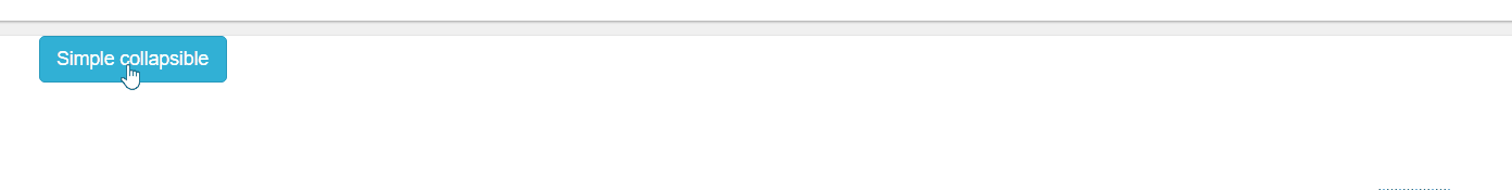
Collapsible Panel1
2
3
4
5
6
7
8
9
10
11
12
13
14
15<div class="container">
<div class="panel-group">
<div class="panel panel-default">
<div class="panel-heading">
<h4 class="panel-title">
<a data-toggle="collapse" href="#collapse1">Collapsible panel</a>
</h4>
</div>
<div id="collapse1" class="panel-collapse collapse">
<div class="panel-body">Panel Body</div>
<div class="panel-footer">Panel Footer</div>
</div>
</div>
</div>
</div>
would be: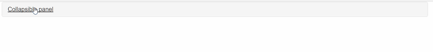
Collapsible List Group1
2
3
4
5
6
7
8
9
10
11
12
13
14
15
16
17
18
19<div class="container">
<div class="panel-group">
<div class="panel panel-default">
<div class="panel-heading">
<h4 class="panel-title">
<a data-toggle="collapse" href="#collapse1">Collapsible list group</a>
</h4>
</div>
<div id="collapse1" class="panel-collapse collapse">
<ul class="list-group">
<li class="list-group-item">One</li>
<li class="list-group-item">Two</li>
<li class="list-group-item">Three</li>
</ul>
<div class="panel-footer">Footer</div>
</div>
</div>
</div>
</div>
would be: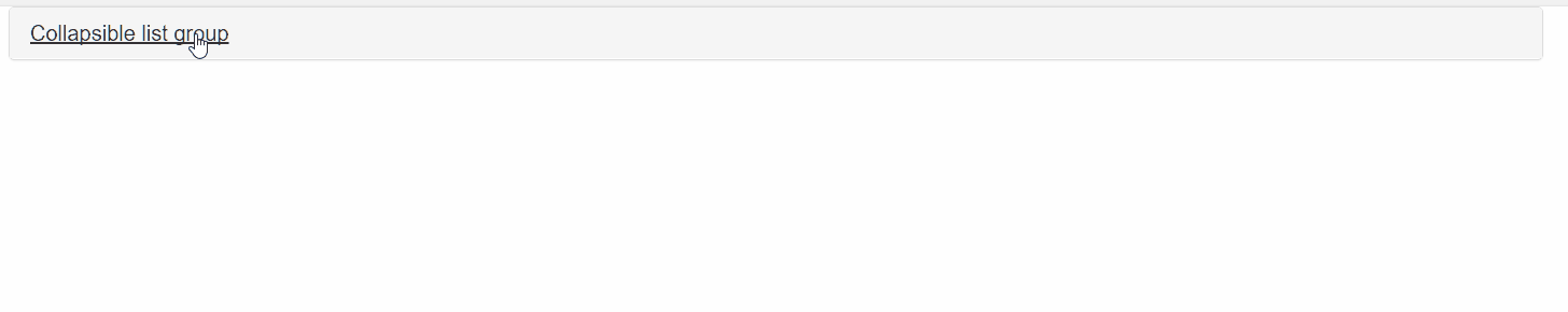
Accordion
Use the .data-parent attribute to make sure that all collapsible elements under the specified parent will be closed when one of the collapsible item is shown.1
2
3
4
5
6
7
8
9
10
11
12
13
14
15
16
17
18
19
20
21
22
23
24
25
26
27
28
29
30
31
32
33
34<div class="container">
<div class="panel-group" id="accordion">
<div class="panel panel-default">
<div class="panel-heading">
<h4 class="panel-title">
<a data-toggle="collapse" data-parent="#accordion" href="#collapse1">Collapsible Group 1</a>
</h4>
</div>
<div id="collapse1" class="panel-collapse collapse in">
<div class="panel-body">Collapsible Group 1.</div>
</div>
</div>
<div class="panel panel-default">
<div class="panel-heading">
<h4 class="panel-title">
<a data-toggle="collapse" data-parent="#accordion" href="#collapse2">Collapsible Group 2</a>
</h4>
</div>
<div id="collapse2" class="panel-collapse collapse">
<div class="panel-body">Collapsible Group 2.</div>
</div>
</div>
<div class="panel panel-default">
<div class="panel-heading">
<h4 class="panel-title">
<a data-toggle="collapse" data-parent="#accordion" href="#collapse3">Collapsible Group 3</a>
</h4>
</div>
<div id="collapse3" class="panel-collapse collapse">
<div class="panel-body">Collapsible Group 3.</div>
</div>
</div>
</div>
</div>
would be: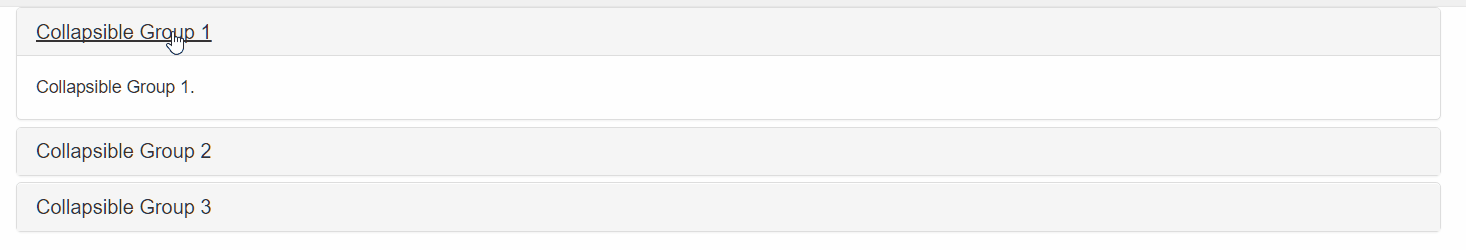
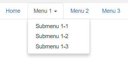
Tabs with Dropdown Menu
Tabs are created with <ul class=’nav nav-tabs’>.
Add .active inside the <li> element to mark the current active tab..dropdown class indicates a dropdown tab. Dropdown menu is specified with <ul> and <li> elements.1
2
3
4
5
6
7
8
9
10
11
12
13
14
15<div class="container">
<ul class="nav nav-tabs">
<li ><a href="#">Home</a></li>
<li class="dropdown active" >
<a class="dropdown-toggle" data-toggle="dropdown" href="#">Menu 1 <span class="caret"></span></a>
<ul class="dropdown-menu">
<li><a href="#">Submenu 1-1</a></li>
<li><a href="#">Submenu 1-2</a></li>
<li><a href="#">Submenu 1-3</a></li>
</ul>
</li>
<li ><a href="#">Menu 2</a></li>
<li><a href="#">Menu 3</a></li>
</ul>
</div>
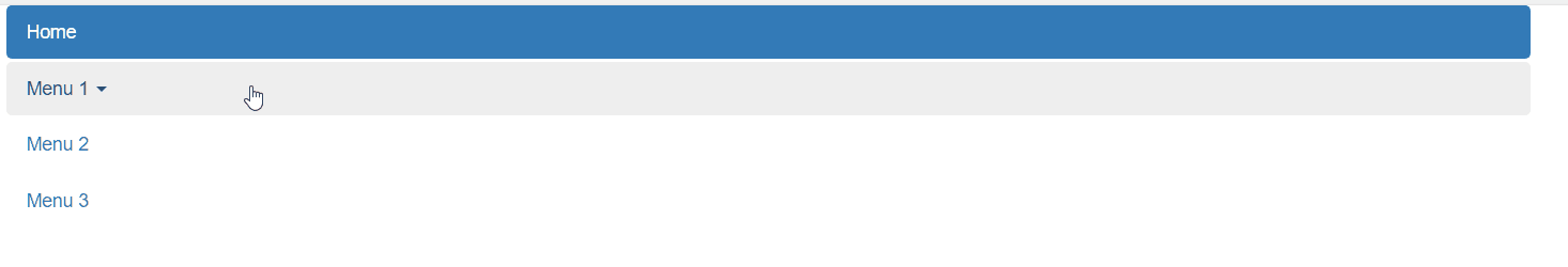
Pills
Pills are created with <ul class=’nav nav-pills’>. Also mark the current page with <li class=’active’>.
Pills can also be displayed vertically, add the .nav-stacked class;1
2
3
4
5
6
7
8
9
10
11
12
13
14
15<div class="container">
<ul class="nav nav-pills nav-stacked">
<li class="active"><a href="#">Home</a></li>
<li class="dropdown">
<a class="dropdown-toggle" data-toggle="dropdown" href="#">Menu 1 <span class="caret"></span></a>
<ul class="dropdown-menu">
<li><a href="#">Submenu 1-1</a></li>
<li><a href="#">Submenu 1-2</a></li>
<li><a href="#">Submenu 1-3</a></li>
</ul>
</li>
<li><a href="#">Menu 2</a></li>
<li><a href="#">Menu 3</a></li>
</ul>
</div>
Tabs and Pills
Centered Tabs and Pills
Add class .nav-justified to center/justify the tabs and pills.
If screens are smaller then 768px, the list items are stacked(remain centered)
1 | <div class="container"> |
would be: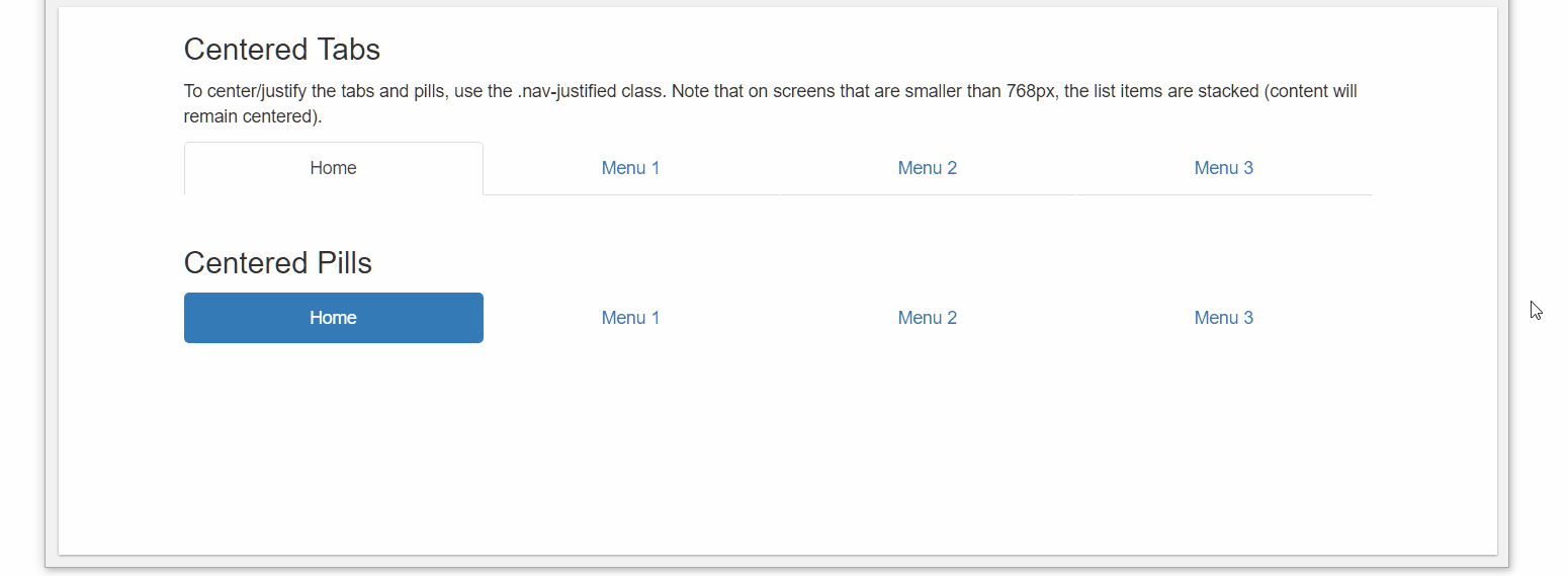
Toggleable Tabs/Pills
To make tabs/pills toggleable, add the data-toggle=’tab|pill’ attribute to each link.
Then, add tab-pane class with a unique ID for every tab and wrap them inside a <div> element with class .tab-content1
2
3
4
5
6
7
8
9
10
11
12
13
14
15
16
17
18
19
20
21
22
23
24
25
26
27<div class="container">
<ul class="nav nav-tabs"> <!--or nav-pills with data-toggle="pill" -->
<li class="active"><a data-toggle="tab" href="#home">Home</a></li>
<li><a data-toggle="tab" href="#menu1">Menu 1</a></li>
<li><a data-toggle="tab" href="#menu2">Menu 2</a></li>
<li><a data-toggle="tab" href="#menu3">Menu 3</a></li>
</ul>
<div class="tab-content">
<div id="home" class="tab-pane fade in active">
<h3>HOME</h3>
<p>Home page</p>
</div>
<div id="menu1" class="tab-pane fade">
<h3>Menu 1</h3>
<p>Menu 1 page</p>
</div>
<div id="menu2" class="tab-pane fade">
<h3>Menu 2</h3>
<p>Menu 2 page</p>
</div>
<div id="menu3" class="tab-pane fade">
<h3>Menu 3</h3>
<p>Menu 3 page</p>
</div>
</div>
</div>
would be: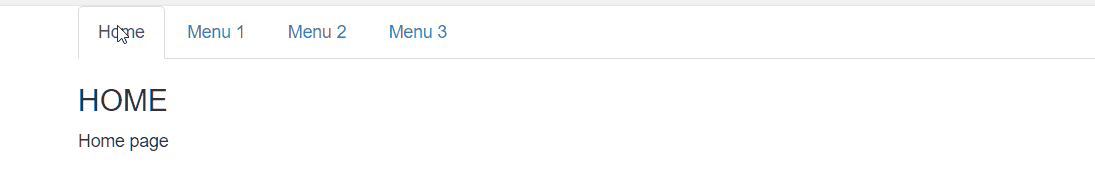
Navigation bars
A standard navigation bar is created with <nav class=’navbar navbar-default’>.
.navbar-inverseis an alternative of the navigation bar style.- Navigation bar can also hold dropdown menus.
.navbar-rightclass is used to right-align navigation bar buttons..navbar-btnclass is use to add a button inside the navigation bar..navbar-formallow us to create a form inside the navigation bar..navbar-fixed-top|bottomis used to fix the navigation bar at the top or bottom of the page.
1 | <body style="height:500px"> |
would be: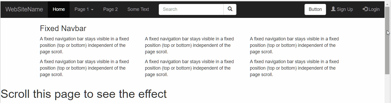
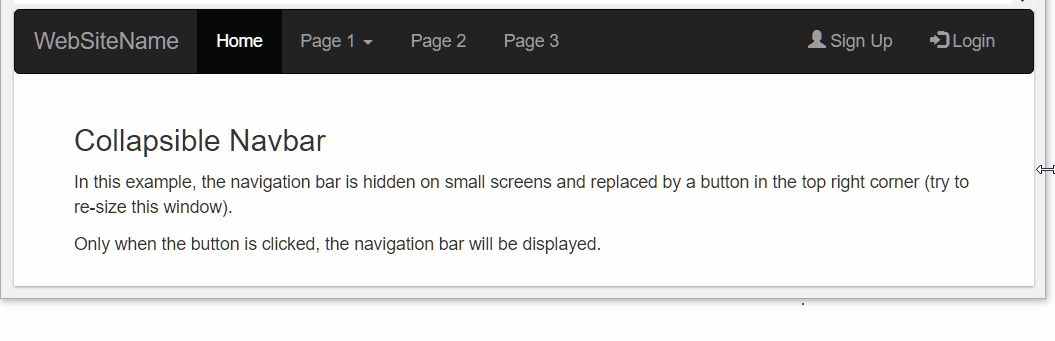
Collapsing the navigation bar
The navigation bar takes up too much space on a small screen, we should hide the navigation bar and only show it when it is needed. The navigation bar is replaced by a button in the top right corner. Only if the button is clicked, the navigation bar will be displayed.1
2
3
4
5
6
7
8
9
10
11
12
13
14
15
16
17
18
19
20
21
22
23
24
25
26
27
28
29
30
31
32
33
34
35
36
37<nav class="navbar navbar-inverse">
<div class="container-fluid">
<div class="navbar-header">
<button type="button" class="navbar-toggle" data-toggle="collapse" data-target="#myNavbar">
<span class="icon-bar"></span>
<span class="icon-bar"></span>
<span class="icon-bar"></span>
</button>
<a class="navbar-brand" href="#">WebSiteName</a>
</div>
<div class="collapse navbar-collapse" id="myNavbar">
<ul class="nav navbar-nav">
<li class="active"><a href="#">Home</a></li>
<li class="dropdown">
<a class="dropdown-toggle" data-toggle="dropdown" href="#">Page 1 <span class="caret"></span></a>
<ul class="dropdown-menu">
<li><a href="#">Page 1-1</a></li>
<li><a href="#">Page 1-2</a></li>
<li><a href="#">Page 1-3</a></li>
</ul>
</li>
<li><a href="#">Page 2</a></li>
<li><a href="#">Page 3</a></li>
</ul>
<ul class="nav navbar-nav navbar-right">
<li><a href="#"><span class="glyphicon glyphicon-user"></span> Sign Up</a></li>
<li><a href="#"><span class="glyphicon glyphicon-log-in"></span> Login</a></li>
</ul>
</div>
</div>
</nav>
<div class="container">
<h3>Collapsible Navbar</h3>
<p>In this example, the navigation bar is hidden on small screens and replaced by a button in the top right corner (try to re-size this window).
<p>Only when the button is clicked, the navigation bar will be displayed.</p>
</div>
would be: